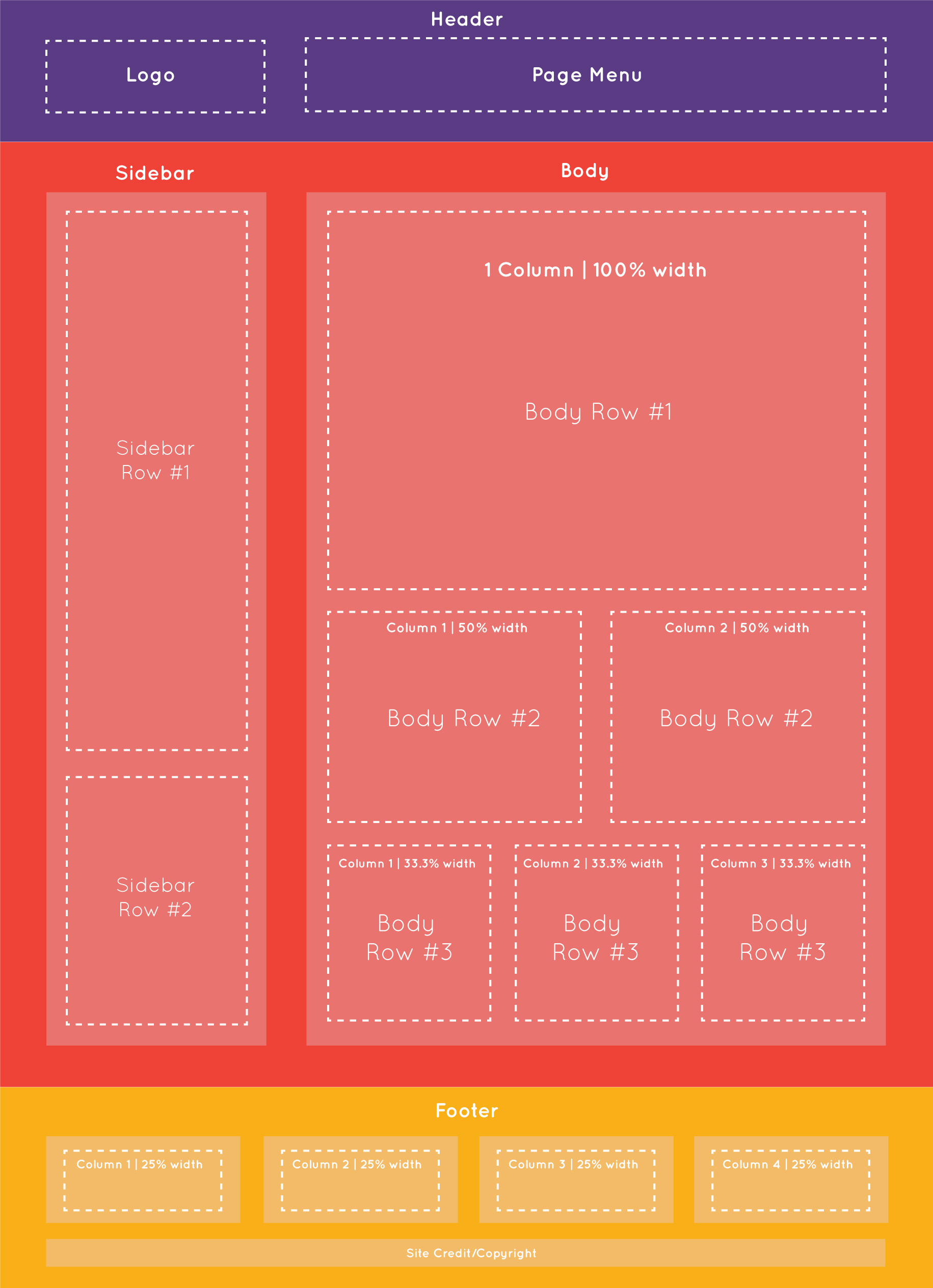
If you would like to create your own custom layouts OVA provides fine control over this. The easiest way to understand how to setout content on a website it is important to understand the underlying structure of a webpage and how this translates onto mobile devices.
Website Structure
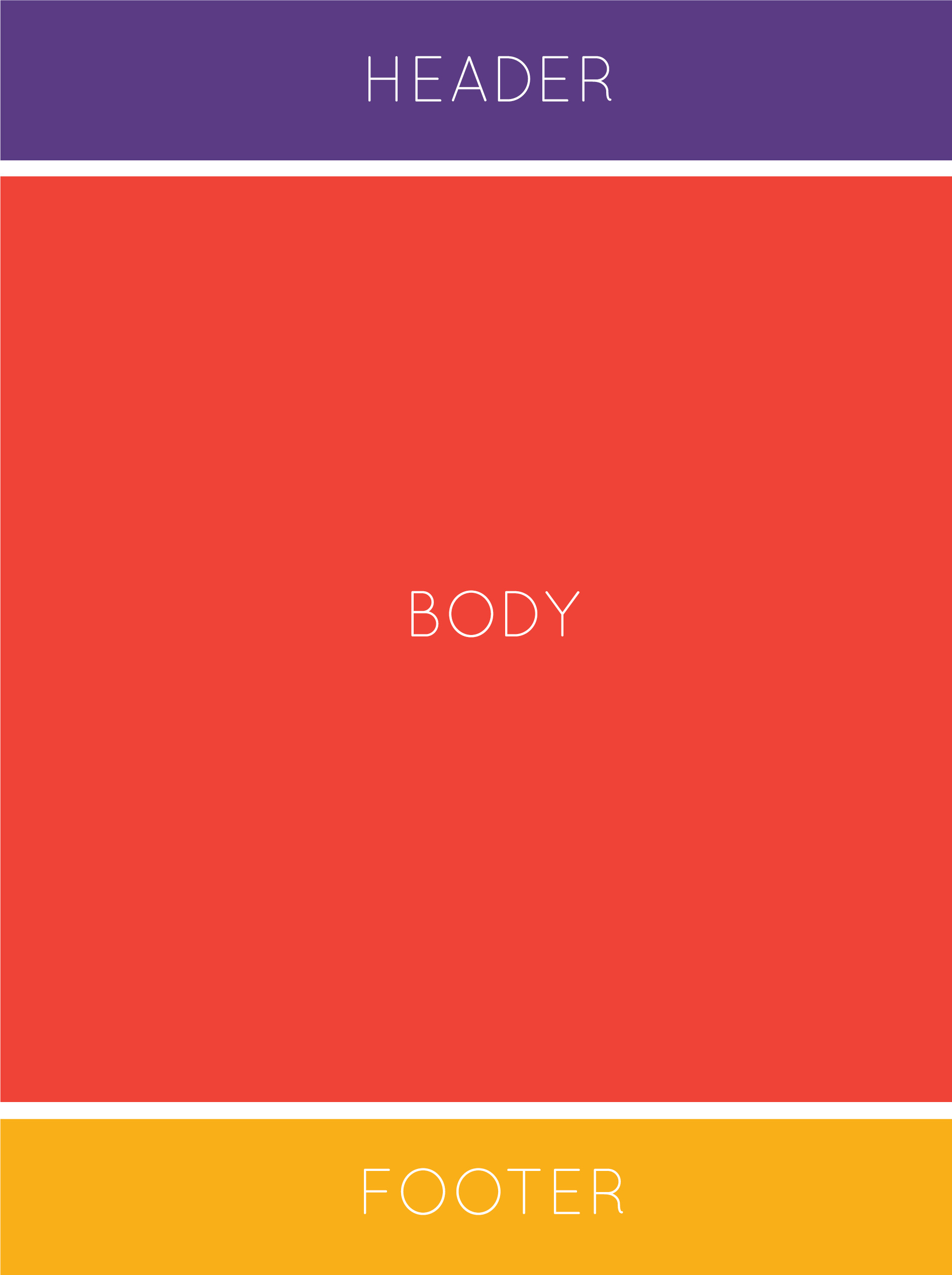
Distilled into its most basic segments a website is made up of a Header, Body & Footer
Header
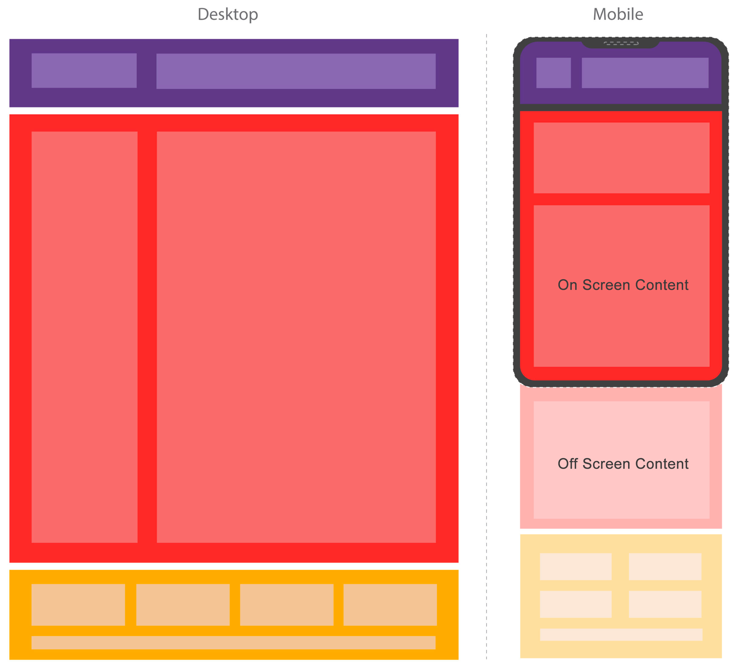
The header commonly sits at the top of the webpage and will in the majority of cases contain navigation and branding items such as the logo and menu items. When displayed on a mobile device, due to the lack of horizontal space, OVA will replace your menu with a hamburger button which will trigger a mobile compatible drop down menu. In most cases the header of the website is the same across all pages.
Related Articles: How to Add Your Logo | How to Add Menu Items
Body
The body of a website contains the majority of content. Generally this is a combination of text, images and various graphics which make up the overall layout of the page but can also include other navigation items such as sidebars used for listing product or blog categories.
Related Articles: OVA Design Tutorials
Footer
The footer is the lower-most section of the website. Generally this will contain and credits and copyright information as well as useful links such as privacy policies, FAQ's and shipping information. Like the Header, the Footer is also usually the same on all pages.
Rows and Columns
Rows and Columns are used to contain and layout the various elements that make up your website. Another way of think about it which many people are familiar with is like a spreadsheet. Websites are made up of columns and rows just like this and the cells of the spreadsheet contain images and text which make up the page.
Rows
Rows represent a full width span of a webpage and are usually used to group and contain multiple columns
Columns
Columns are used to break up a row into segments. Most websites are single or double columns but you can have up to 12 columns in most cases. Keep in mind that the total width of the columns is limited by the size of the device being used to view the website. With this in mind, it is good practice for most users to stick to under 4 columns, especially with text, to avoid over-wrapping of text.
On a mobile device OVA will automatically stack each columns underneath each other to avoid very slim columns of text. This is whats commonly known as a 'responsive layout'.
Adding Columns and Rows to Your Webpage
For information on adding columns and rows to your webpage please visit the following article.
1 row 1 column
1 row 2 columns
1 row 2 columns
1 row 3 columns
1 row 3 columns
1 row 3 columns
The dotted lines are used to illustrate the confines of where the content would sit. Usually these are invisible.
From the example above we can see some of the most common row and column layouts used. In most cases these will stack underneath each other on a mobile device unless overwritten as in this case.
Modules
Modules are the visual building blocks which make up your website. If the columns and rows are the frame and bricks then the Modules are the paint and furniture. OVA includes a vast array of different modules depending on your requirements. You plan place these into your columns inside the OVA builder just click the ![]() button at the top right then select 'modules'. Choose the module you would like to add and then click and drag it into your chosen column. Some examples of our most used modules include:
button at the top right then select 'modules'. Choose the module you would like to add and then click and drag it into your chosen column. Some examples of our most used modules include:
Basic Modules
- Text
- Photo
- Video
- Heading
- Separator (line)
Media Modules
- Image Slider
- Icons
- Gallery
- Testimonial
- Map
Action/Advanced:
- Call to Action
- Contact Form
- Countdown
- Table
- Button
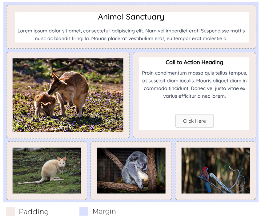
Using the previous example, lets add in a combination of text and image modules into the columns to illustrate how this layout might translate into the real world.
Animal Sanctuary
Lorem ipsum dolor sit amet, consectetur adipiscing elit. Nam vel imperdiet erat. Suspendisse mattis nunc ac blandit fringilla. Mauris placerat vestibulum erat, eu tempor erat molestie a.
1 Row 1 Column Layout

Call to Action Heading
Proin condimentum massa quis tellus tempus, at suscipit diam iaculis. Mauris aliquet diam in commodo tincidunt. Donec vel justo vitae ex varius efficitur a nec lorem.
1 Row 2 Column Layout


1 Row 3 Column Layout. The dotted lines are used to illustrate the edges of the column. Usually these are invisible unless a border value is defined
Padding & Margins
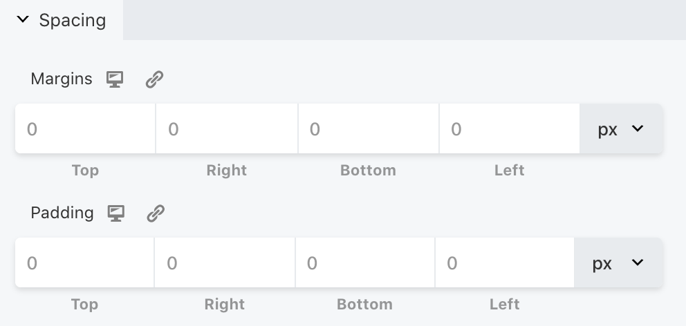
From within each column and row you also have control over the spacing of elements. We do this by controlling the Padding and Margins. Inside most Rows, Column and Modules inside OVA is an 'Advanced' tab. This tab provides fine control over the padding and margin for all sides.
At the end of the value boxes is a dropdown where you can choose your units between 'px' or '%'. 'px' adjusts the spacing in 'pixels'. '%' uses a percentage of the bowser width which means this spacing is proportionate to the width of the browser.
Clicking on the small screen icon ![]() to the right of the Margin and Padding titles will cycle between Desktop, Tablet and Mobile layouts allowing you to specifically set the padding and margin for these devices. If you do not set a value for a specific device then OVA will default to the largest proceeding value.
to the right of the Margin and Padding titles will cycle between Desktop, Tablet and Mobile layouts allowing you to specifically set the padding and margin for these devices. If you do not set a value for a specific device then OVA will default to the largest proceeding value.
Clicking on the chain link ![]() icon will link all icons to the same value. If you would like to disconnect this link and adjust each value separately simply click the icon again.
icon will link all icons to the same value. If you would like to disconnect this link and adjust each value separately simply click the icon again.
Padding
Padding controls the spacing between the edges of the module and the column it sits inside.
Margins
The margin controls the spacing between the column/row and other columns and rows on the page.

